2018 Irish AeroPress Championship - The Poster.
04 August 2018

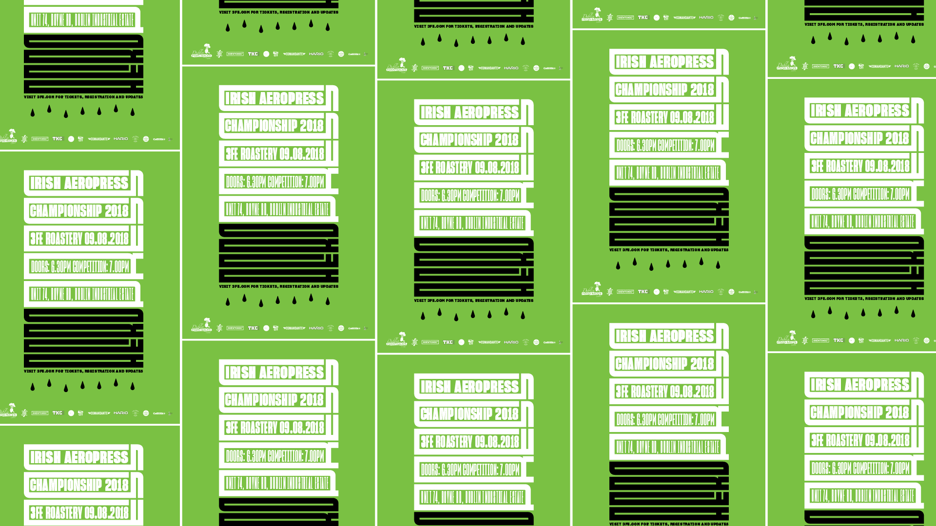
You will have probably seen The Irish AeroPress Championship 2018 poster on Instagram, Facebook and twitter, as well as throughout cafes across Ireland. With its bold text and vibrant colours, its pretty hard to miss! We chatted with the team recently to get the details on the design and thought process behind the poster, continue reading below..
"WorkGroup is a graphic design studio in Dublin, based not far from the Grand Canal Street 3fe location. The studio has been involved with 3fe from the start, working on the visual identity, branding and a host of other outputs. We also designed and built the 3fe sites for retail and wholesale along the way. Archie Heaslip took the lead on this collaborative process with other designers in the studio.
We knew that the poster had to be an eye catching, striking image that would pique the interest of both those involved in the coffee making world world and also the regular viewer.
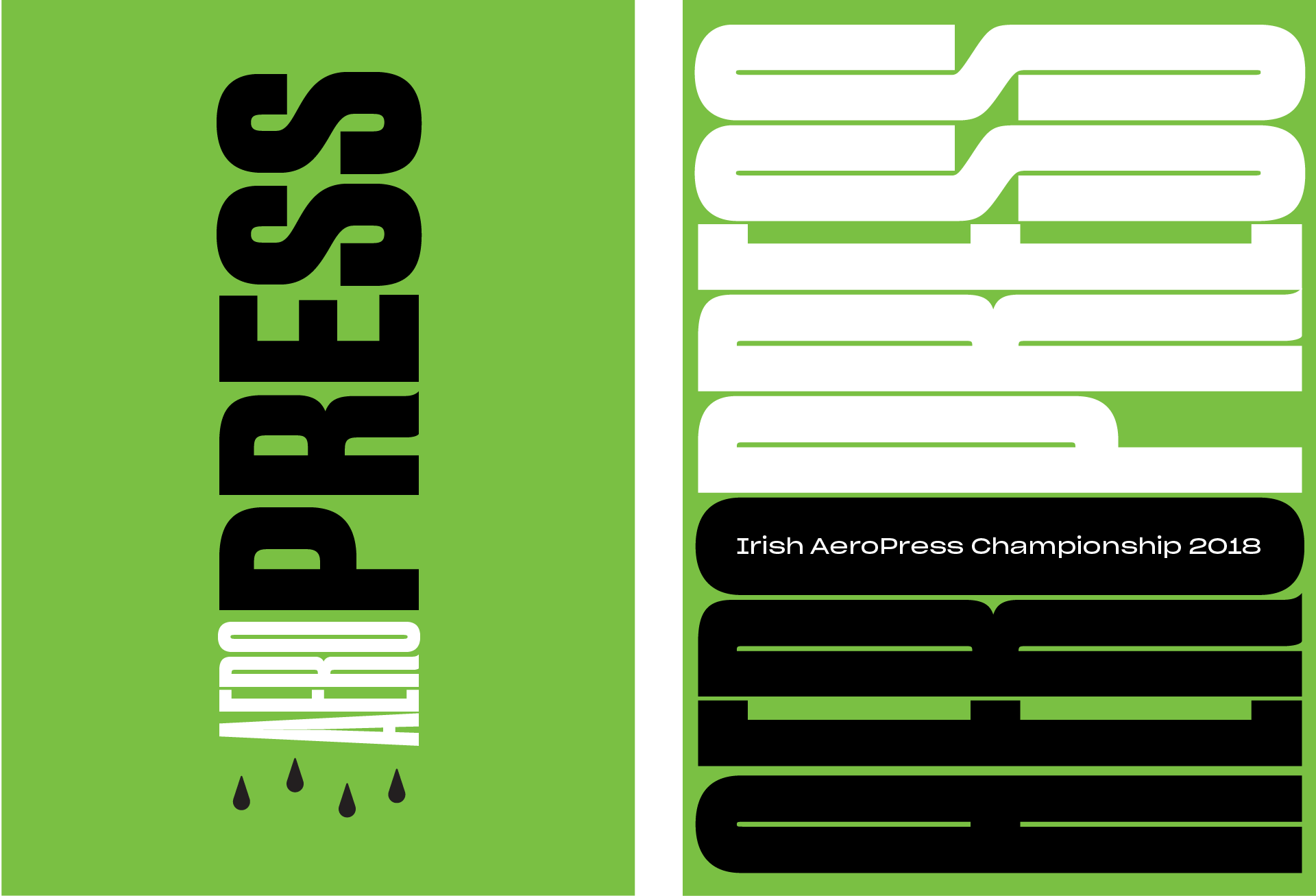
The poster is a typographic illustration, something that allows us to combine the message and medium in a layout. Placing the word ‘Aeropress’ on its side creates a sense of playfulness and allows the typography to become an abstract representation of an Aeropress. The bold use of green, black and white create high contrast and alludes to the fact that it’s the Irish Aeorpress championship while avoiding the typically used trope of green, white and orange to represent Irishness.

We modified a typeface called ‘Fit’ for the Aeropress motif, with ‘Sharp Grotesk’ used for the competition information. Both fonts are either variable or come in a huge range of widths and weights, allowing us to depict the sense of movement in an Aeropress. Combined together, the result is an abstract typographic representation of an Aeropress that portrays both the pressure that is created in the process of making coffee with an Aeropress and also the tension of an Aeropress competition.
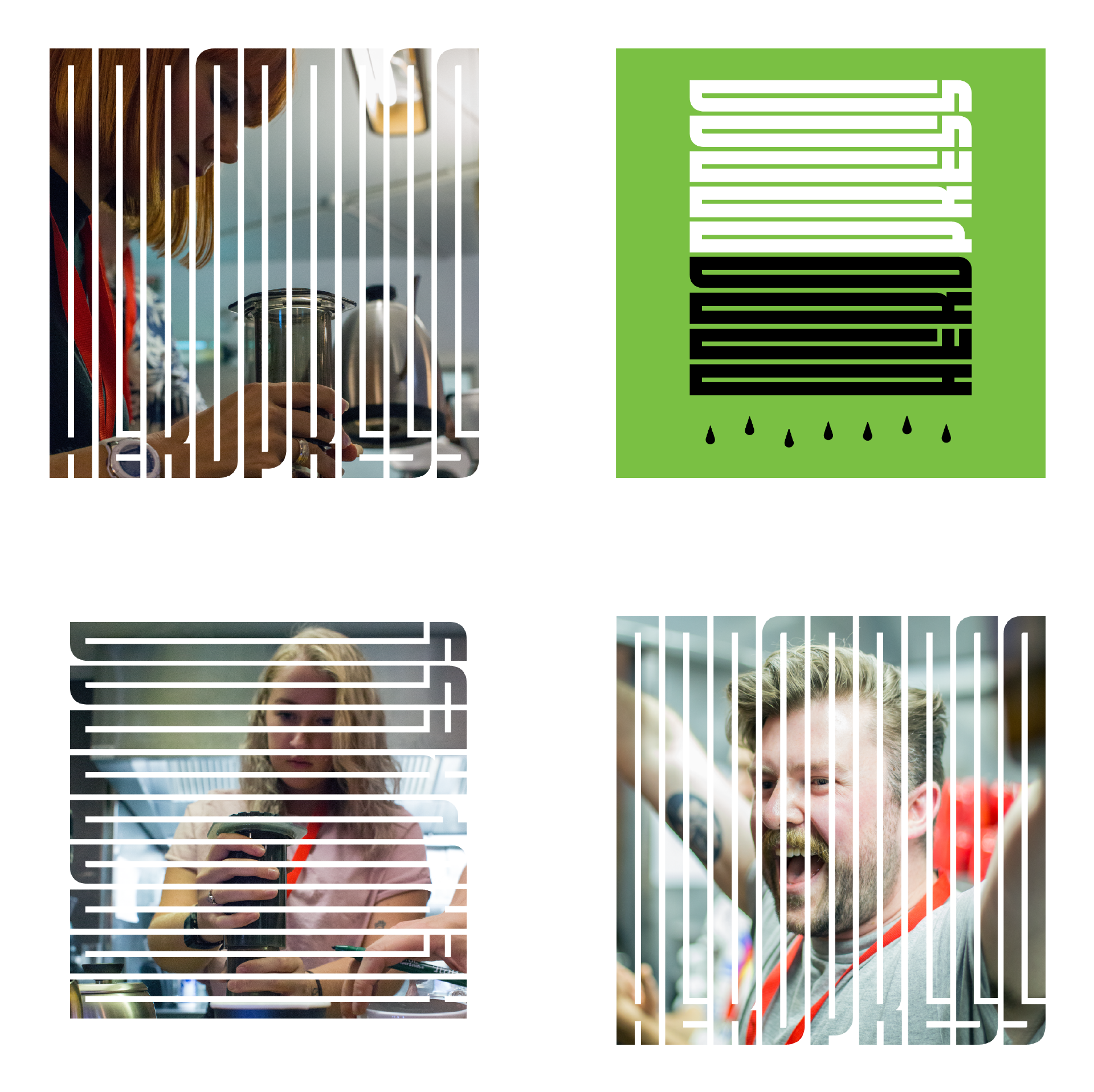
On our way to the final version, we went through a number of iterations. Some of the earlier versions were more representative of an actual Aeropress while others were more graphically captivating. The final poster was a combination that incorporated the best of both worlds and resulted in a playful poster that still had graphic impact. Some of the previous compressed iterations, where no information was included, were used as a framing device for social media posts and for the 3fe site."

We are delighted with how the poster turned out and we will have them available to purchase on the night and on our web-shop for €5.